Marknadens största urval
Snabb leverans

Böcker utgivna av Unit Editions

Filter
Filter
Sortera efterSortera Populära
  • av Harry Pearce
    499,-

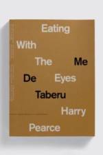
    Eating With The Eyes is a visual mediation and a photographic recording of accidental events spanning over a decade and collected from Harry Pearce¿s journeys around the world. Harry Pearce is a Pentagram partner, eternal optimist, human rights activist, dream diary keeper, graphic designer, accidentalist and photographer. Harry¿s photographs are the culmination of a lifetime of practice that began during his childhood in the West Country, when his father gifted him with a Pentax camera. From this point onwards, Harry began meticulously documenting quirks, human interventions and coincidences. From these images he began to piece together a sometimes tragic, sometimes funny and always poignant continuity and rhythm in the world that surrounds us. Pearce says, ¿I get lost in the process of recording seemingly accidental events. As time has passed, I¿ve come to realise that there are no true accidents, only ideas trying to find us. We are surrounded by a constant stream of ideas, insights and visions. Every moment in every place. Abstract and accidental as they may seem, they are to my eyes precise, illuminating and elevating.¿ The book ¿ which features an introduction from Charles Saumarez Smith, the CEO of the Royal Academy of Art, is an insight into Pearce¿s mind and shows a fundamental part of his process as a graphic designer. Over the past three decades Pearce has worked with some of the worlds best-known brands and artists, to devise identities, installations, posters, packaging, and books. These include: the Royal Academy of Arts, John Lewis, Phaidon Press, Saks Fifth Avenue, Lloyds of London, Ai Weiwei, Anish Kapoor and the UN. This edition comes in two colour combinations (brown and grey) that will be shipped to customers at random.

  •  
    539,-

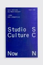
    Studio Culture Now features in-depth interviews with a host of leading design studios. The interviewees share their experiences, insights, fears and joys, and reveal how they deal with the fundamentals and aspirations of studio life. Candid and generous, these extensive Q&As form a blueprint for anyone planning a studio practice, or anyone struggling with maintaining one. Topics covered include: getting jobs, working with clients, balancing creativity with profitability, accounting, hiring, promotion, wellbeing, and much more. The interviews, mostly conducted in the past few months, also reveal how studios are adapting to the changes brought about by the coronavirus pandemic.

  • av David Cabianca
    719,-

    Ed Fella: A Life in Images includes a wide selection from his 60 years of work across, effectively, his two careers. A 316pp visual essay forms the centrepiece of the book. Designed by Fella in his own inimitable style, this is a visual history of a remarkable life in images, as told by the man himself. This section contains a wide range of Felläs artworks, sketchbook pages and collages; examples from various illustration and print ad commissions; Polaroids and photographs; alongside many of his instantly-recognisable type-based flyers. The book also features an introduction by Katherine McCoy; essays by Lorraine Wild, Rick Poynor and David Cabianca ¿ focusing on Felläs long career, his extensive sketchbook work and his flyers, respectively ¿ and an Afterword by his daughter, Andrea Fella.

  • av Adrian Shaughnessy
    895,-

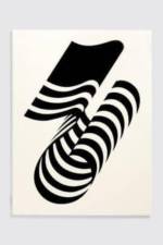
    Matt Pyke, founder and creative director of Universal Everything, calls his studio a ¿digital art and design collective¿. And after 15 years of revolutionary work in the digital realm, UE has its first book ¿ What is Universal Everything? Working closely with Pyke, the Spin design team of Tony Brook and Claudia Klat have designed a book that successfully brings Universal Everything¿s vivid on-screen work to the printed page. The book is printed using a unique salmon pink fluoro colour that has been specially created and mixed for the project. What is Universal Everything? examines 24 of the studiös most exciting projects, from work for clients such as Microsoft, Hyundai and MTV, through to projects for Radiohead and the Science Museum in London. For each piece of work, Pyke collaborates with a pool of international creative talent from his base in Sheffield in the north of England. The book also focuses on several of UE¿s self-initiated projects that keep the studio pushing forward. These speculative explorations, says Pyke, are concerned with ¿trying to invent the future before we get there¿. The book also includes two essays and extensive interviews throughout, 90 pages of Pyke¿s hand-drawn sketches, as well as detailed listings of the studiös numerous sources of inspiration ¿ from music to literature; from places to food. In keeping with the book¿s high production values, nearly all the work featured in the book has been re-rendered at high res, allowing the full majesty of Universal Everything¿s screen-based work to be captured on the printed page. Furthermore, every cover of What is Universal Everything? is unique: a different tipped-in image graces the cover of each edition. As Pyke notes: ¿We developed software to generate random combinations of shapes, colours and sizes with collision detection. Thousands of unique graphic compositions have been generated.... Everyone will own a one-off.¿

  • av Adrian Shaughnessy
    429,-

    This book is a near facsimile of the one-off, leather-bound `sketchbook¿ that Lance Wyman made to catalogue his design process for the creation of a logo and graphic identity for the 1976 USA Bicentennial celebrations to mark the creation of the USA as an independent republic. This is a record of the creative process that Wyman went through to arrive at a refined and workable solution. It is rare for designers to reveal so much of their inner workings, and even rarer for it to be documented with this degree of thoroughness ¿ but Lance Wyman is no ordinary designer. The work was done in Mexico in 1970 ¿ Wyman had gone there to design the graphics for the Mexico 68 Olympics. But in 1971 he returned to the USA, and to a design scene that was markedly different from the one he had left. For a start, he had acquired a stellar reputation. One year after Wyman¿s return to New York, Richard M Nixon, the 37th president of the USA, instigated Federal Design Improvement Program, a far ranging initiative aimed at producing better design for government funded projects. Wyman was to work on numerous projects that came from this, some of them amongst the most celebrated of his career: National Zoo (1975), Washington Mall (1975), Minnesota Zoo (1979). But before working on any of these large-scale civic projects, he took part in a competition to design the graphics for the Bicentennial celebrations. As can be seen in the pages of this book, Wyman approached the task with his customary mix of graphic rigor and visual ingenuity. In an opening interview with Adrian Shaunghnessy, Wyman explains the genesis of the project, the reasons why it was never implemented and discusses the importance of process in any designer¿s work. `There is a role for this book to show process, to show how a concept is the first step, and how an idea is refined over time. It¿s a process. It¿s not instant.¿ Lance Wyman

  • av Karlssonwilker
    255,-

    New York-based design studio Karlssonwilker take on `Americä in the debut issue of ON, Unit¿s new print platform where designers examine a single subject. For ON #1, Karlssonwilker examine their adopted home of America in their own inimitable style. As outsiders who have been working in the US for 18 years, Jan Wilker and Hjalti Karlsson ¿ German and Icelandic, respectively ¿ offer up ¿a compilation of our thoughts and observations on our surroundings and encounters throughout our years in New York¿. The result is a heady mixture of graphics, illustration and photography; charts, diagrams, (definitely not fake) facts and wry observations, centred around an extensive Q&A between Wilker and Unit¿s Adrian Shaughnessy. From thoughts on ¿design as entertainment¿ to discussing the challenges of running a design studio in the city that never sleeps, the interview sees Wilker recount his first, eventful 24-hours in New York City in 1999 and frames the studio¿s recent move to Ridgewood, Queens after 16 years in Manhattan. ¿Over time, we have been slowly digested, and the edges of our hesitation and European arrogance softened away, to be replaced by something American that we now treat as if it had always been part of us.¿ Karlssonwilker

  • av Alexandra Sankova
    539,-

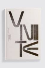
    Written by the Moscow Design Museum's Alexandra Sankova and Olga Druzhinina, this book tells the previously untold story of the VNIITE - the All-Union Scientific Research Institute of Technical Aesthetics. Formed in Soviet Russia in 1962, by the design visionary Yuri Soloviev, this cast network contained Moscow's most progressive designers. THh 'Vniitians', as they were called, designed for the future and developed new theories and approaches to design in the USSR. But more than fifty years later, the organisation is all but forgotten. It's hard to fathom how such an institution, dedicated to the promotion of utopian design, in theory and in practice, and the improvement of design standards within the Soviet Union, could have faded so far from view. After the disintegration of the USSR, the VNIITE and its library of images and prototypes were presumed lost. Until now, that is. Thanks to the efforts of the Moscow Design Museum - and the discovery of the personal archives of some of the VNIITE designers - the story of this remarkable organisation is being pieced back together. Alongside images of sketches, models and prototypes, the book also includes a selection of covers of one of the USSR¿s hidden gems of graphic design ¿ the VNIITE¿s monthly journal, Technical Aesthetics. Showcased together for the first time, these covers chart Soviet graphic trends from the 1960s to the early 1990s. In the pages of this book you can see some of the more compelling examples of utopian Soviet design. As the designer Paula Scher notes, the work offers a balance between `the communist desire for a perfectly-designed world against the real world of human competitiveness and inequality¿.

  •  
    255,-

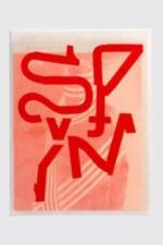
    Spin/Adventures in Typography 2 is serious and silly in equal measure (occasionally at the same time). The Spin team of Tony Brook, Claudia Klat and Jonathan Nielsen have embarked on a journey into typography¿s darkest recesses. Searching for the new and the surprising, they have made a series of experiments, by computer and by hand, that stretch the boundaries of typographic expression almost to breaking point. Chapters in this 52pp journal include Alien: Future/Font: Lettuce/Letters; Helvetica Alt: Dr Frankenstein¿s Helvetica; Helvetica est mort; and Tape Face. You have been warned.

  • av Tony Brook
    729,-

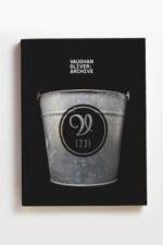
    The book is a celebration of the Vaughan Oliver Archive, a treasure house of graphic delights housed at UCA Epsom. Oliver is the designer who kept the stuff other designers threw away: proofs, running sheets, paper labels for vinyl records, original artwork for classic album covers, videotapes, books and the weird ephemera that was the source of inspiration for many of his most famous works. Vaughan Oliver: Archive (`Materials and fragments¿) is arranged around a set of themes ¿ colour, hybrid forms, typography, the body, mystery, etc. It also features a selection of his exquisitely designed press ads, most of them unseen since the day they were published in the music press. Designed by Spin and written by Adrian Shaughnessy, the book features many previously unseen works, including extensive interviews with Oliver, and with contributions from Chris Bigg, his long-standing creative accomplice.

  • av Andreas Uebele
    489,-

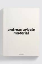
    `Everything is material. Material is a starting point from which something new arises. We¿re assigned a task and we take it forward; we add to what already exists¿ - Andreas Uebele A major presence in contemporary German graphic design, Andreas Uebele trained as an architect, a thread that continues to present itself in much of his work. From the graphics of the Reichstag to the iconic signage of the Vitra campus, his experiments lead to dynamic solutions, while simultaneously maintaining lightness and clarity. This new book presents 85 of büro uebele¿s projects through two types of materials: the raw materials from which they emerged, and materials from creative collaborators whöve accompanied the studio along the way. These include Matthew Carter, Adrian Frutiger, Massimo Vignelli and Hermann Zapf.

  • av Adrian Shaughnessy
    679,-

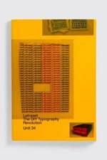
    Letraset: The DIY Typography Revolution is the first comprehensive history of Letraset, the rubdown lettering system that revolutionised typographic expression. The book tells the Letraset story from its early days as a difficult-to-use wet system, to its glory years as the first truly democratic alternative to professional typesetting. The book also looks at Letraset¿s present-day revival amongst a new set of admirers who recognise the typographic excellence of the system¿s typefaces. The book comes with a gatefold Letraset timeline. It has an introduction by Malcolm Garrett, and features in-depth interviews with Mr Bingo, Erik Brandt, Aaron Marcus, David Quay, Dan Rhatigan, Freda Sack, Andy Stevens and Jon Wozencroft. Essays by Colin Brignall, Dave Farey and Mike Daines ¿ all key members of the Letraset team ¿ provide expert insight into the rise of Letraset as a typographic and commercial powerhouse. A central essay by Adrian Shaughnessy examines the typographic and cultural impact of the system. The book¿s design is by the Spin team of Tony Brook and Claudia Klat. It uses many rare specimens from Letraset¿s past ¿ catalogues, press ads, mailers, storage units, and of course, sheets of classic Letraset typefaces.

  •  
    369,-

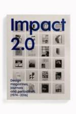
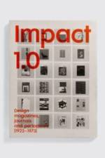
    In this book you will find the covers of design magazines, journals and periodicals of all kinds. They cover many topics ¿ graphic design, typography, architecture, interiors, print, theory and history. But above all, they are brilliant specimens of innovative visual design. There¿s no better place to view the stylistic rollercoaster of graphic design than the covers of design magazines ¿ it¿s a fast-track education in the history of design and typography. As Steven Heller notes: ¿As we head deeper into the age of hand-held devices, covers will become obsolete. So, it is for this reason that preserving and archiving these documents of international design, one cover at a time, is beyond useful.¿

  • av Unknown
    925,-

    Manuals 2 is a comprehensive study of corporate identity manuals from the golden era of identity design. As a companion volume to Manuals 1, Manuals 2 is a carefully-curated collection of 20th-century style guides, or as Steven Heller calls them ¿ ¿sacred texts, revered for how they help shift graphic design from simply an intuitive practice to a rigorously strategic one¿. In today¿s landscape, designers and, increasingly, non-designers rely on digital templates to implement brand identities ¿ fast, accurate and easily updatable, these digital manuals are now obligatory. But, in the eyes of many, we have lost something in the transition to digital style guides, and there is a growing recognition that the great printed standards manuals from the pre-digital era deserve a better fate than to be junked. Manuals 2 makes a strong case for their survival and continued appreciation. The book includes reproductions of 20 design manuals created for US and European institutions and corporations including IBM, Westinghouse, Canadian National Railway (CN), Bell System, Knoll, PTT, the Montreal Olympics and the Dutch police. Many of them have been designed by the giants of 20th-century identity design, including Lester Beall (USA), Paul Rand (USA), Allan Fleming (Can), Total Design (NL), Alan Fletcher (UK), Otl Aicher (Ger), Studio Dumbar (NL) and North (UK). Each manual featured in Manuals 2 has been expertly photographed, retaining all essential details, and is presented in a spacious and functional layout, allowing the reader to fully appreciate these wonderful examples of sophisticated information design. Manuals 2 comes with a substantial essay by design historian R. Roger Remington (Vignelli Distinguished Professor of Design) and an insightful text by Martha Fleming, daughter of Allan Fleming, designer of the Canadian National Railway logo. Also included are in-depth interviews with experts in the field of identity design: Michael Burke (UK/Germany), Sean Wolcott (USA), Liza Enebeis (NL) and John Bateson (UK). The foreword is written by the legendary Lance Wyman, designer of the 1968 Mexico Olympic Games and many other important brand identities.

Gör som tusentals andra bokälskare

Prenumerera på vårt nyhetsbrev för att få fantastiska erbjudanden och inspiration för din nästa läsning.