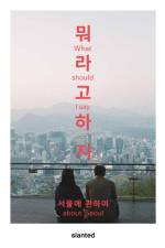
Marknadens största urval
Snabb leverans

Böcker utgivna av Slanted Publishers UG

Filter
Filter
Sortera efterSortera Populära
  • av Slanted Publishers
    395,-

    Experimental Type deals with experimental design strategies in typography and graphic design. The issue presents projects incorporating the accident into the design process, works based on mistakes and inaccuracy, fonts that derive from a concept or a system-in the end work that experiment or goes unconventional ways in design. The publication showcases cutting edge approaches as well as new experimental procedures, from processing to ai-generated typefaces or variable fonts. The different works offer glimpses into spaces that were explored by pushing conventions, limitations, and thoughts to the next level.The issue is based on Slanted Magazine #40-Experimental Type, which sold out shortly after publication. This issue 2.0 is extended by some works and appears completely in black and white print.

  • av Nigel Cottier
    519,-

    Nach dem Erfolg von Letterform Variations präsentiert Nigel Cottier in seinem neuen Buch Alphabetical Playground eine Studie über das Alphabet als Medium. Entstanden ist ein Katalog mit zahlreichen Alphabeten und Buchstabenformen (schätzungsweise 7.000), die alle unter Verwendung einer Reihe von Systemen, Codes und Thematik zur Erzeugung von Ausdruck und Form geschaffen wurden.Die Themen reichenvon A: Alphanumerisch: eine Familie von Alphabeten, die alle nach dem alphanumerischen Code aufgebaut sind (A = 1, B = 2, C = 3 usw.),über C: Kursiv: Eine Anspielung auf kursive Schriftsysteme und aneinander gereihte Alphabete, die aus Buchstaben bestehen, die mit einer einzigen durchgehenden Linie gebildet werden,bis L: Letterswithin Letters (Buchstaben in Buchstaben): Ein alphabetisches System, bei dem jede Buchstabenform mehrere Buchstaben enthalten kann, so dass ein einziger Text tatsächlich verschiedene Botschaften enthalten kann.

  •  
    519,-

    Seit 2002 lobt der Verein 100 Beste Plakate e.V. den Wettbewerb für die herausragendsten und kreativsten Plakatentwürfe aus Deutschland, Österreich und der Schweiz aus. Die Einreichungen bilden die Vielfalt eines Mediums ab, das sich im öffentlichen Raum Aufmerksamkeit verschaffen und mit visualisierten Botschaften die Nähe zur freien Kunst behaupten kann.Das Jahrbuch 2024 präsentiert die siegreichen Plakate des Wettbewerbs "100 Beste Plakate 24" in großformatigen Abbildungen, mit Angaben zu den inhaltlichen Aspekten und des Entstehungskontexts. Es diskutiert die aktuelle Plakatgestaltung und zeigt Trends auf.Ergänzend dazu gibt es ein Kontaktregister aller Gestalterinnen und Gestalter sowie Verzeichnisse von Auftraggebern und Druckereien. Das vorliegende Jahrbuch hat sich längst als Standardreferenz für Schaffende in der Grafik- und Designszene etabliert.Die Publikation wird in diesem Jahr vom Baseler Studio Tristesse gestaltet und bietet allen prämierten Plakaten einen großen Auftritt auf der Posterbühne.

  •  
    369,-

    Slanted Magazine #45-Sex ist in Zusammenarbeit mit dem Münchner Archive Artist Publications (AAP) unter der Leitung des Künstlers und Archivars Hubert Kretschmer entstanden. Diese Ausgabe schöpft aus einer der weltweit umfangreichsten Privatsammlungen von Künstlerpublikationen, die Hubert Kretschmer seit den 1980er Jahren zusammengetragen hat. Sie enthält über 89.988 seltene Zines, Hefte, Poster und andere Druckerzeugnisse. Slanted Magazine #45-Sex zeigt aus zeitgenössischer und historischer Perspektive eine Auswahl an künstlerischen Positionen, die sich mit Körperpolitik, Selbstverständnis und Identität auseinandersetzen. Bei der Gestaltung visueller Narrative sind marginalisierte Körper - nicht-binär, queer, behindert, rassistisch - oft unterrepräsentiert oder werden auf symbolische Art und Weise dargestellt. Das Slanted Magazine #45-Sex lädt die Leserinnen und Leser ein, diese Konventionen zu hinterfragen, und ermutigt zu einem kritischen Blick auf die Rolle der Medien bei der Darstellung von Körpern. Mit provokanten Bildern und vielfältigen Geschichten öffnet das Slanted Magazine #45-Sex die Tür zu einem tieferen, facettenreichen Dialog über Körper und Zugehörigkeit.

  •  
    605,-

    Support Independent Type II ist eine Fortsetzung des erfolgreichen Buches Support Independent Type, das 2020 erschien.Support Independent Type II versteht sich als Manifest und als visuelles Schaufenster, in dem über 300 innovative Schriftgestalter*innen mit ihren Arbeiten vorgestellt werden.Das Buch taucht tief in die Welt der Schriften ein, zeigt neue Trends auf, präsentiert innovative Designs und macht das Buch damit selbst zum Kunstobjekt. Mit dieser sorgfältig kuratierten Sammlung unterstreichen die Herausgeber und Autor*innen, wie unabhängiges Schriftdesign kulturelle Veränderungen widerspiegeln und Innovationen anregen kann. Eine umfassende Inspirationsquelle für jeden Grafikdesigner, alle Schriftbesessenen und jede Kreativdirektorin.

  •  
    369,-

    Nach dem Erfolg der ersten beiden Ausgaben wird Slanted Experimental Type zu einer fortlaufenden Reihe, die in jeder Ausgabe neue Ansätze in Typografie und Grafikdesign erforscht. Die dritte Ausgabe, Slanted Experimental Type 3.0, in Zusammenarbeit mit Studierenden der Fachhochschule Dortmund unter der Leitung von Prof. Lars Harmsen und Andreas Ruhe entwickelt, führt völlig neue Inhalte ein, die die Grenzen des kreativen Experimentierens erweitern.Wenn Grenzen willkürlich gezogen werden, lassen sie oft geografische, ethnische oder historische Realitäten außer Acht, was zu Spannungen und Konflikten führt. Während diese Themen von der Typografie weit entfernt scheinen, bietet die Anwendung solcher Überlegungen auf das Design faszinierende Herausforderungen. Designer setzen sich oft mit ihrer Rolle in einem verbraucherorientierten System auseinander und stellen den Zweck ihrer Arbeit in Frage. Diese Ausgabe befasst sich mit Designstrategien, die Zufälle, Ungenauigkeiten und unkonventionelle Methoden einbeziehen, und zeigt Schriften, die aus einzigartigen Konzepten oder Systemen entstanden sind. Von KI-generierten Schriften bis hin zu variablen Fonts - Slanted Experimental Type 3.0 stellt Normen in Frage und definiert den Designprozess neu. Es ist eine Einladung, Neuland zu betreten, die Perspektive zu wechseln und die Grenzen zu hinterfragen - sowohl im Design als auch darüber hinaus.

  •  
    375,-

  •  
    289,-

  • av Slanted Publishers
    369,-

    This issue of Slanted is not about war. It's about amazing people from the creative industry in and from Ukraine, trying to live a "normal" life, working super hard and giving their best, showing that culture and design cannot be separated. Slanted Magazine #43 is dedicated to the Ukrainian design scene. Despite the impossibility of visiting studios on location as in previous issues of Slanted Magazine, extensive contacts in the Ukrainian design scene helped to put together this diverse and complex magazine. This selection of works by Ukrainian designers, typographers and graphic designers was carefully chosen from 1,500 submissions - they exemplify the independence and resilience of Ukrainian design.

  • av Charlotte Axelsson
    379,-

    "Tender Digitality" describes an aesthetically oriented concept that sets a binary system in motion and portrays humans as Human Digitalus. In doing so, it responds to the need to experience sensuality, perception, intuition, and well-being in digital environments, making this experience tangible and developing a language for it."Tender Digitality" operates in the space between analog and digital, social and technical phenomena, weaving them into ever-changing, never fixed patterns. In this way, it shapes, reflects, and fosters a community where individuals and artificial intelligences, avatars, and cyborgs navigate digitally, intuitively, and sensitively, contributing to a gentle co-creation.The focus is on initial categorization and conceptual clarification, socio-cultural aspects such as grief, loss, and distance in the digital world, design-oriented and artistic methods for applying "Tender Digitality," and the interaction between humans, machines, and human-machine hybrids.With this publication, perspectives and discussions are intended to be illuminated and debated in various forms such as essays, poetry, images, and graphics.

  • av Beste 100
    485,-

    X/100 - Expect Nothing - Appreciate EverythingThe motto of this year's 100 Best Posters is enticing and keeps its promise: Every year, the association 100 Beste Plakate e. V. honors the most outstanding and creative poster designs from Germany, Austria and Switzerland. The accompanying yearbook has long since established itself as the standard reference for creators in the graphic and design scene. The 2023 yearbook presents the winning posters from the "100 Best Posters 23" competition in large-format illustrations, with information on the content aspects and the context in which they were created. It discusses current poster design and highlights trends.In addition, there is a contact register of all designers as well as directories of clients and printers.

  • av Eric Fritsch
    419,-

    Düsseldorf University of Applied Sciences reflects on a diverse and vibrant tradition in the field of poster design. Starting in 1968 with Uwe Loesch's corrugated cardboard posters, through the subtle design concepts of Helfried Hagenberg, works by Fons Hickmann and Andreas Uebele, to contemporary works by talented students.Some of the posters featured in this book have become part of the collections of the Museum of Modern Art (MOMA) or the Museum of Design in Zurich. Due to their exemplary design, many of these posters have received numerous awards.In this book, the texts and posters are arranged like a galley proof on a continuous strip. The working title for the book's design was "Poster Novel," exploring narrative forms for an ongoing story that raises the question: Are posters still surfaces that catch the eye? The title "Das Plakat isst eine Fläche" is a German wordplay for "The poster eats/is a surface". This book contains posters from Düsseldorf University of Applied Sciences since 1968, featuring works by artists such as Inga Albers, Heribert Birnbach, Dieter Fuder, Wolf Erlbruch, Hilde Gahlen, Tino Graß, Fons Hickmann, Holger Jacobs, Wilfried Korfmacher, Anika Kunst, Laurent Lacour, Uwe Loesch, Alexander Mainusch, Jens Müller, Stephanie Passul, Charlotte Rohde, Lilo Schäfer, Thomas Spallek, Philipp Teufel, Andreas Uebele, Piotr Zapasnik, and many others.

  • av Slanted Publishers
    289,-

    In August 2023, Slanted Publishers is going on a trip to Tbilisi, Georgia and Yerevan, Armenia. The aim is to explore the impact of the war in Ukraine on the local culture and design scene. Numerous conversations and interviews provide deep insights into people's lives and work.The introduction is by Wojciech Górecki and Krzysztof Strachota, both respected experts in the region who work for the Center for East European Studies (OSW) and head the department for Turkey, the Caucasus and Central Asia. The photo series were contributed by students from Dortmund University of Applied Sciences and Arts, who have maintained close links with Georgia for several years.

  • av Potsdam University of Applied Sciences
    189,-

    The term "Studio Practice" not only describes the place where art and design are created. It also refers to the complex process between thinking and creating in which creativity is made possible on a daily basis. Every artist and every designer works differently, follows different routines and is inspired by different things, places and encounters. New works are created and formed from ever new sources.We talk to artists and graphic designers about the routines and techniques they use to shape their daily work and surprise themselves time and again. A magazine full of inspiring examples that takes readers on a journey to and through very different studio practices.Some Magazine is a visual culture publication that offers a behind-the-scenes look at the "invention of images" and is aimed at artists and designers. It is written, designed and produced by design and art students under the direction of Prof. Sven Völker and is an integral part of the experimental graphic design seminar at the University of Applied Sciences in Potsdam. Perhaps due to its dynamic nature as a student project, Some Magazine has successfully established itself in the indie magazine scene over the years.

  • av Potsdam University of Applied Sciences
    189,-

    For over one hundred years, we humans of the post-postmodern times have turned ourselves into outstanding visual athletes. We made visuality our superpower. Now we are about to change the rules of the game right in the middle of it. Will all this result in some new weird kind of blindness?This issue of Some Magazine is dedicated to the skill, the craft and the pure joy of looking!With contributions by Blatant Space, Catelijne van Middelkoop, David Horvitz, Eleonora Marton, Melody "LeMoon" Bossan and Rob Lowe.

  • av Jannis Maroscheck
    509,-

    Three years after "Shape Grammars" (2020), Jannis Maroscheck returns with an updated look on machine-generated graphics and the core motif of mass produced ideas: "Latent Figures." Looking for forms of expression hidden between ancient runes and y2k logos, medieval monograms and clip art illustrations, hieroglyphs and stock icons, Maroscheck developed AI-based systems to merge the shared visual vocabulary designed by humans across eras, continents and cultures. The underlying process simulates human inspiration, but it is an analytical, objective process. The systems consider form as pure form. They draw no reference to real-world things. In doing so, they have a stubborn intensity to them, that seems less like human creativity and more like a strange, unstoppable force of nature.The resulting catalog is a dive into the inner workings of an AI that has seen nothing but graphic shapes and symbols. With this sort-of-dictionary, Maroscheck creates a visual language that blends pragmatic graphic design aesthetics with elusive imagery. A collection of shapes that often approximate something we know or can understand, but their meaning doesn't quite want to resolve, they revolve around themselves, somewhere between meaning and nonsense. Offering a space to project ones own imagination and come across new ideas. "When I think about it, something like a graphic form, black and white, defined only by its outline, feels quite limited in what it can express, what it can communicate. Then I look at it, like a blob of ink, continuously reshaping itself, in flux, automatic and open in all directions." Jannis Maroscheck

  • av Slanted Publishers
    375,-

    Slanted #42-BOOKS ist ein Magazin über Bücher. Ist die Zukunft des (gedruckten) Buches an seine sinnliche Qualität gebunden ist? Wie können schöne Bücher ihren Platz in den Medien und der Gesellschaft sichern? Wie sind Inhalt, Medium und Form miteinander verbunden? Ist Herstellungs- und Gestaltungsqualität neben ihrer Funktionalität nur noch als Marketingargument zu verstehen? Slanted stellt in dieser Ausgabe experimentelle Gestaltungsstrategien vor - Bücher, die im Gegensatz zu klassischen Büchern unkonventionelle Wege gehen. Gesucht werden Unfälle, Arbeiten, die auf Fehlern und Ungenauigkeiten beruhen, Cutting-Edge-Ansätze sowie neue experimentelle Verfahren, von der Verarbeitung bis zum KI-generierten Inhalt. Im Gegensatz dazu präsentiert Slanted Publishers zeitlose Buchgestaltungen, bei denen der Inhalt die Form bestimmt.

  • av Gianpaolo Tucci
    635,-

    This is not a book on typography, but the expression of a point of view, a practical guide, and an investigation on how the integration and ethical use of artificial intelligence will play a fundamental role in modeling this future.

  • av Slanted Publishers
    619,-

    Letters and fonts not only transport information, but also convey a feeling and have a personality. Type in its artistic diversity has the potential to release energies, to inspire and to tell stories through harmony or distortion. Words become drawings and images that stimulate the imagination and open up spaces beyond information.From the success of the Yearbook of Type concept, Slanted Publishers has has developed a new book series: The Yearbook of Lettering. The first volume presents a selection of lettering artwork from around the world - from traditional calligraphy and handlettering to street art and graffiti - and shows the wide range of different styles and techniques. The book offers an overview of high-quality handmade typographic art with an extensive glossary of lettering artists. A source of inspiration for anyone interested in lettering and hand-crafted typographic art, not just lettering artists.

  • av Eliana Berger
    325,-

    It is impossible not to believe because we all have a perspective on the world, and this is reflected in our beliefs. We say "I believe that" when expressing our opinion. We don't believe someone else when their views differ greatly from our values and worldview. However, belief is not static. Our perspective can change, and belief can change us. Did you know that belief influences our perception of pain, and that we hold different beliefs depending on whether we are speaking our native language or another?This volume brings together interviews on the topic of "belief" from various scientific disciplines. It includes interviews with social psychologist Pia Lamberty, political scientist Hendrik Ohnesorge, neuroscientist Katja Wiech from the University of Oxford, linguist Panos Athanasopoulos, economist Nicola Gennaioli, Paul Hedges, professor of Interreligious Studies in Singapore, and Alexander Kaurov from the Institute for the History of Science at Harvard University.With illustrations by artist Daria Chernyshova.

  • av Erich Brechbühl
    485,-

    In the Swiss province, at the foot of picturesque mountains, on a quiet lake, a biotope of avant-garde design has formed. The self-proclaimed "Poster Town" Lucerne has managed to merge the boundaries between art and design, creating a contemporary design phenomenon in the process. We are talking about the posters for the Neubad Cultural Center, which have long since found their way out of the valley and all over the world. The posters, in minimalist black and white, not only set contemporary design trends, but playfully transcend the boundaries of our perceptual habits. Progressive illustration and experimental typography create subcultural codes on a highly cultural level that remain unpretentious despite their artistic daring. The Neubad Poster is an aesthetic phenomenon and an expression of a social change that has always been expressed in fashion, music, design-in other words, in the zeitgeist. The book as a collection of curated pieces that in itself formulated a new expression of this emerged aesthetic.

  •  
    469,-

    "It is a sign of wisdom to negotiate instead of fighting" spoke H¿ Chí Minh, Vietnamese revolutionary and politician. He died in 1969 during the Vietnam War and did not live to see the withdrawal of the American invaders and the reunification of his homeland. As prime minister and president until his death, he determined the destiny of his country, whose people affectionately called him Uncle H¿. Influenced by deep Marxist-Leninist convictions, he became a worldwide symbol of the striving for self-determination. Even today, gratitude for this is omnipresent in the Vietnamese population. The book is a collection of selected quotes from H¿ Chí Minh juxtaposed with Michael Herman's expressive photographs of modern Vietnam.

  •  
    375,-

    The Slanted team went to Amsterdam to check out the design scene and fell for the charm of the city's century-old "bruine kroegen" (brown cafes). Seeking refuge after bike rides to design studios, they were quickly won over by the cozy ambiance, dark wood, old-fashioned decor, and the aroma of fried croquettes. Color and form play an important role in Amsterdam's design, which is egalitarian and serves the masses. Design is ubiquitous in Amsterdam, from the bike path to the police cars and even the city crest. The maze of canals and the upcoming neighborhoods are characterized by muted tones, dominated by black cobblestones, and dark brick. Behind the facades it rattles. The Dutch have always let it rip. The orange is more intense, the red more luminous, the black more brutal. Design is radical, it crashes, it vibrates. There are few places where color and form play such an important role. Design is innovative, modern, functional, and spiced with a pinch of humor. Design is about egalitarianism, not reserved for the wealthy elite. Design serves the masses. And so it happens that everything is professionally designed. The bike path, the kebab stand, the tax return form, the police cars, the park benches and trash cans, the vegetables. In its 41st issue, Slanted gathers a selection of Amsterdam's most brilliant minds and provides deep insights into their work and values in the magazine and in the numerous video interviews. Illustrations, interviews, essays, and an extensive appendix with many useful tips and an overview with the best Dutch writings complete the issue thematically.

  • av Lars Harmsen
    585,-

    COLLISION by Lars Harmsen is the collision of intuition and the human experience. A visual journey of photographs, design, and ideas. With this publication, the author mercilessly settles accounts with the last 10 years of his creative work. Numerous pieces and creations, from Slanted, PosterRex and 100for10 to freelance works and other projects have been destroyed, cut up and reassembled. A maximum of carnage. With a minimum of diplomacy. Raban Ruddigkeit wrote about the work: "A year ago Lars bought a boat. He has actually been sailing all his life. He sails as a designer over the trends and hypes, over the egos and the shooters. In his work he connects drops to water and waves to a sea. Now and then he expresses himself in his own graphic language. Especially when, as today, the sea becomes rougher and more uncomfortable. Then Lars brings out his unwavering compass-a true sailor only proves himself in the storm."

  • av David Wiesner, Omid Fröhlich & Youijn Kim
    335,-

    How could visiting Seoul be described in a way that allows someone else to feel like they are right there? What to say? What perspectives to choose? »What Should I Say-About Seoul« takes the reader on a path less traveled: The work and daily-life of Korean designers; but not just as a spectator. Traveling invites the traveler to question one's own perspective. The reader is invited to also learn about Korean designers' views on Germany. The insights found through this process are inspiring as well as challenging.»What Should I Say-About Seoul« gives a glimpse into South Korean society that is not so common after all. The editors focused on the works and experiences of designers. Some of the insights into the Seoul work experience appear grim at places, colored by the ongoing pandemic that forced people to cut down on social interactions.Also included are the experiences of Korean-German designers in the book and through that is could be noticed that there is really no reason to think of Germany as a country that "has it figured out." The modern workplace can be a very mixed bag at times and bad working conditions plague the creative ­industry worldwide. Speaking about these experiences allows us to feel less isolated and work towards change-so it is not all doom and gloom.

  • av Markus Lange
    499,-

    Karl-Heinz Drescher (born on October 7, 1936 in Quirl; died on May 19, 2011 in Berlin) was a graphic artist working at Bertolt Brecht's world famous theater Berliner Ensemble as a graphic designer for almost 40 years. In addition to his work at this house, Drescher also worked for other organizers, museums, galleries, and theaters, amongst others the Akademie der Künste der DDR, the Maxim-Gorki-Theater, and the Deutsche Staatsoper in Berlin. His catalog of works today comprises over 400 posters, about one third printed with letterpress.In a one-year research, the designer Markus Lange contacted Drescher's family and conducted various interviews with companions and friends to find out more about this talented designer, who studied from 1955 to 1960 in the former GDR at the same school as he did (Burg Giebichenstein, formerly Hochschule für industrielle Formgestaltung).For the first time, this book summarizes most of Drescher's (typographic) posters in one comprehensive volume and contains texts and interviews by various authors such as Dr. Friedrich Diekmann, Dr. Sylke Wunderlich, Helmut Brade, Niklaus Troxler, Gerd Fleischmann, Jamie Murphy, Erik Spiekermann, Ferdinand Ulrich, Götz Gramlich, Peter Kammerer, Vera Tenschert, Cesarina and Alessandro Drescher. "Karl-Heinz Drescher-Berlin Typo Posters, Texts, and Interviews" serves as a review of the life of an extraordinary theater graphic designer but also as an inspiration for the here and now.

  • av Stefan Braun
    409,-

  • av Martin Lorenz
    679,-

    Flexible Visual Systems fasst 10 Jahre Forschung von Martin Lorenz an der Universität Barcelona, 20 Jahre Entwicklung von Systemen bei TwoPoints.Net und 18 Jahre Lehre von Systemen an über 10 Designhochschulen in ganz Europa auf 320 Seiten zusammen.Flexible Visual Systems ist das Gestaltungshandbuch für moderne visuelle Identitäten. Es vermittelt eine breite Palette von Gestaltungsansätzen flexibler Systeme, die sich an jede Ästhetik und jedes Projekt anpassen lassen, die eine visuelle Sprache benötigen.Es ist ein Ansatz, wie man gestaltet. Wenn man Systemdesign in einen Lehrplan aufnehmen würde, wäre es der Grundkurs, der in die richtige Denkweise versetzt. Der Ansatz kann auf jede Disziplin angewendet werden, von Corporate Design, Kommunikationsdesign, User Experience Design bis hin zu Textildesign.Das Buch ist in drei Teile gegliedert:- Der erste Teil ist eine illustrierte theoretische Einführung, die die Vergangenheit, Gegenwart und Zukunft flexibler Systeme erläutert. Er beschreibt, wie sie in der Vergangenheit verwendet wurden, wie sie heute eingesetzt werden und warum sie nicht nur formale Lösungen darstellen sollten, sondern auch die Art und Weise beeinflussen können, wie wir arbeiten.- Der zweite Teil ist eine visuelle praktische Beschreibung, wie man flexible Systeme in Form von Kreis, Dreieck, Quadrat, Fünfeck und Sechseck gestaltet. Mit vielen Anleitungen und Beispielen.- Der dritte Teil erklärt, wie Transformationsprozesse durch flexible Systeme zu visuellen Identitäten werden können. Besonders kreative Programmierer*innen, Motion Designer*innen und experimentierfreudige Menschen werden mit diesem Kapitel viel Freude haben.Flexible Systeme zu entwerfen heißt nicht nur, ein weiteres Handwerk zu erlernen, es kann die Denk- und Arbeitsweise von Gestalter*innen völlig verändern.

Gör som tusentals andra bokälskare

Prenumerera på vårt nyhetsbrev för att få fantastiska erbjudanden och inspiration för din nästa läsning.